Getting Started
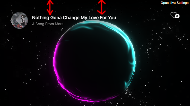
Plasmic Audio Player, a powerful, responsive, and extremely customizable, versatile player with playlist support with .mp3, Shoutcast, and Icecast supported formats, seamlessly running on all major browsers and mobile devices, including iPhone, iPad, iOS, Android, MAC, and Windows, elevating your website's audio experience to a whole new level.
It is built using EcmaScript6 using the latest JavaScript and CSS standards. The 3D sphere and particles use Three.js and WebGL shaders running exclusively on the device's GPU.
Please note that it will not work locally, it has to run on an HTTP or HTTPS protocol.
Installation
Choose one of the preset HTML files from the build folder and open it in a text editor as a refference.
In the download files inside the build folder you will find the src folder that contains the JavaScript code and content folder that contains the CSS file and other important files like the vector font, the content folder has to be uploaded on the server where the player is used.
Include the player CSS file and JavaScript in the header:
<head>

<!-- ... -->
<link rel="stylesheet" href="./content/global.css">
<script type="text/javascript" src="./src/FWDPAP.js"></script>
<!-- ... -->

</head>
The next step is to add the initialize code in the page header or footer after the inclusion of the player JavaScript and CSS files.
<script type="text/javascript">
if(document.readyState == 'complete'){
fwdpapSetupPlayers();
}else{
document.addEventListener('DOMContentLoaded', ()=>{
fwdpapSetupPlayers();
});
}
function fwdpapSetupPlayers(){
new FWDPAP({
// Main settings.
instance: 'fwdpap0',
displayType: 'responsive',
parentId: 'myDiv',
playerDataId: 'playerData',
proxyCorss: '',
initializeWhenVisible: 'yes',
maxWidth: 1920,
maxHeight: 800,
minHeight: 520,
autoScale: 'yes',
showScrubbersToolTips: 'yes',
showLiveSettings: 'yes',
showLiveSettingsFrameCounter: 'no',
addKeyboardSupport: 'yes',
googleAnalyticsTrackingCode: '',
backgroundColor: '#000000',
// Audio.
autoPlay: "no",
loop: 'no',
shuffle: 'no',
randomizeTracks: 'no',
// Controls.
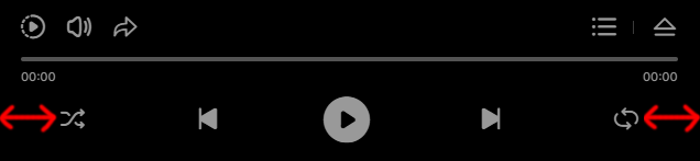
usePlayerControls: 'yes',
showOnlyPlayButton: 'no',
showPlayerControls: 'yes',
showArtwork: 'yes',
showArtistAndTitle: 'yes',
showCloseButtton: 'yes',
showPlayPauseButtonWhenHidden: 'yes',
showLikeButton: 'yes',
showPlayButton: 'yes',
showNextAndPrevButtons: 'yes',
showShuffleButton: 'yes',
showLoopButton: 'yes',
showScrubber: 'yes',
disableScrubber: 'no',
showTime: 'yes',
showArtistAndTitleToolTips: 'yes',
controlsOffsetHeight: 0,
startGap: 16,
endGap: 12,
gapBetweenCenterButtons: 24,
scrubberAndTimeBottomGap: 12,
rightSideGapBetweenButtons: 4,
gapBetweenArtworkOrTitle: 14,
verticalGapBetweenTitleAndArtist: 8,
scrubberCircleRadius: 10,
compactScrubberCircleRadius: 12,
scrubberCircleTooltipGap: 6,
compactScrubberCircleTooltipGap: 8,
scrubberHeight: 2,
scrubberAndTimeHorizontalGap: 20,
maxScrubberAndTimeWidth: 800,
showCompactVersionAtWidth: 720,
compactTopElementsStartGap: 20,
compactCenterButtonsStartAndEndGap: 14,
compactButtonsStartGap: 15,
compactButtonsEndGap: 16,
compactButtonsVerticalGap: 10,
compactTimeVerticalGap: 66,
compactScrubberVerticalGap: 50,
compactScrubberStartGap: 20,
compactScrubberEndGap: 20,
compactScrubberHeight: 4,
controlsBackgroundColor: '#000000',
artistAndTitleToolTipsBackgroundColor: '#1A1A1A',
titleTextColor: '#FFFFFF',
artistTextColor: '#999999',
artworkBackgroundColor:'#3A3A3A',
lineSeparatorColor: '#3A3A3A',
controlsButtonsIconNormalColor: '#999999',
controlsButtonsIconSelectedColor: '#FFFFFF',
timeColor:"#999999",
scrubberBackgroundColor:"#535353",
scrubberProgressColor:"#FFFFFF",
scrubberToolTipBackgroundColor:"#1A1A1A",
scrubberToolTipTextColor:"#FFFFFF",
likeInfoBackgroundColor: '#FFFFFF',
likeInfoTextColor: '#000000',
// Volume & playback speed.
showVolumeButton: 'yes',
showPlaybackSpeedButton: 'yes',
defaultPlaybackRate: 1, //min - 0.5 / max - 2.5
volume: 1,
volumeScrubberCircleRadius: 10,
compactVolumeScrubberCircleRadius: 12,
volumeScrubberCircleTooltipGap: 6,
compactVolumeScrubberCircleTooltipGap: 8,
volumeScrubberMainWidth: 26,
volumeScrubberMainHeight: 120,
volumeScrubberWidth: 2,
compactVolumeScrubberWidth: 4,
volumeBackgroundColor: '#1A1A1A',
volumeScrubberBackgroundColor: '#535353',
volumeScrubberProgressColor: '#FFFFFF',
volumeScrubberToolTipBackgroundColor: '#1A1A1A',
volumeScrubberToolTipTextColor: '#FFFFFF',
// Share.
shareButtons:['facebook', 'twitter', 'linkedin', 'tumblr', 'pinterest', 'reddit', 'buffer', 'digg','blogger'],
shareBackgroundColor:"#191919",
shareText:"Share via",
shareTextColor: '#FFFFFF',
shareLineSeparatorColor: '#3A3A3A',
// Playlist.
showPlaylist: 'yes',
startAtTrack: 0,
playlistItemHeight: 80,
playlistMobileItemHeight: 80,
playlistEndGap: 20,
showPlaylistArtwork: 'yes',
showPlaylistPlayButton: 'yes',
showPlaylistLikeButton: 'yes',
showPlaylistAudioVisualizer: 'yes',
hidePlaylistOnItemPlay: 'no',
scrollbarWidth: 2,
scrollbarTrackColor: '#535353',
scrollbarHandlerNormalColor: '#999999',
scrollbarHandlerSelectedColor: '#FFFFFF',
playlistSeparatorColor: "#1A1A1A",
playlistVisualizerBarsColor: '#FFFFFF',
playlistItemNormalBackgroundColor: '#000000',
playlistItemSelectedBackgroundColor: '#0C0C0C',
playlistItemTitleColor: '#FFFFFF',
playlistItemArtistColor: '#999999',
// Sphere.
segmentsCount: 712,
mobileSegmentsCount: 256,
macOSSegmentsCount: 256,
useDrag: 'yes',
showFront: 'no',
useUnrealBloomPass: 'yes',
useUnrealBloomPassOnMobile: 'yes',
unrealBloomPassTintColor: '#ff07fd',
unrealBloomPassTintStrength: 0,
unrealBloomPassStrength: 0.8,
unrealBloomPassRadius: 0.316,
unrealBloomPassThreshold: 0,
uBackgroundColor: '#000000',
uSphereRotationDirection: 'clockWise', // clockWise, counterClockWise
cameraOffsetZ: 6,
cameraOffsetZWhenCompact: 6,
cameraOffsetYWhenCompact: .13,
uSphereStartAngleY: 0,
uSphereRotationSpeed: .4,
uLightAColor: '#ff07fd',
ulightAIntensity: 1.85,
uLightAColorPhi: 0.615,
uLightAColorTheta: 2.049,
uLightBColor: '#32ffff',
ulightBIntensity: 1.4,
uLightBColorPhi: 2.561,
uLightBColorTheta: -1.844,
uDistortionFrequency: 2.615,
uDistortionStrength: 0.65,
uDisplacementFrequency: 2.120,
uFresnelOffset: -1.9,
uFresnelMultiplier: 3.557,
uFresnelPower: 1.793,
// Particles.
showParticles: 'yes',
particlesCount: 800,
mobileParticlesCount: 800,
uParticlesRotationDirection: 'counterClockWise', // clockWise, counterClockWise
particlesMinRadius: 1,
particlesMaxRadius: 4,
uParticlesRotationSpeed: .6,
particlesSizeFactor: .5,
particlesAmplitudeColor: '#FFFFFF',
particlesMidsColor: '#FFFFFF',
particlesTrebleColor: '#FFFFFF',
}
)
}
</script>The last step adding the player is to create a div with an unique ID that will act as the parent/holder for the player and set the parentId option to point to the div id ex: parentId: 'myDiv', this div can be added anywhere in your page.
<!-- Player holder. -->
<div id="myDiv"></div>
To add multiple players just redo the steps explained above and make sure to change the instance to fwdpap1, fwdpap2, fwdpap3, etc... depending on how many players are added, also change the parentId to a different ID and if you want add a different playlist by also change the playerDataId to point to a different playlist.
Please read the settings section to understand the player configuration options.
Setup playlist
A playlist is created by adding in the page inside the body a div with an unique ID and setting the display style to none, this will be used only as the playlist data markup, This unique ID has to be added as the value of the playerDataId option in the player settings like this playerDataId: 'playerData'.
<!-- Player playlist. -->
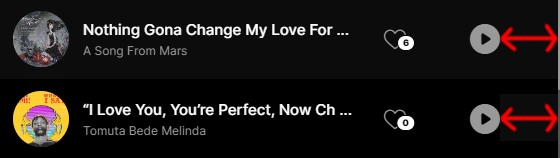
<div id="playerData" style="display: none;">
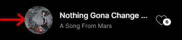
<div data-src="media/mp3/01.mp3" data-artwork-src="media/images/1.jpg" data-likes="6">
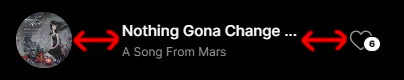
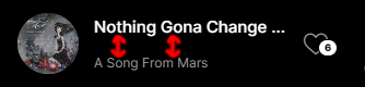
<div data-title>
<p class="fwdpap-title">Nothing Gona Change My Love For You</p>
</div>
<div data-artist>
<p class="fwdpap-artist">A Song From Mars</p>
</div>
</div>
<div data-src="media/mp3/02.mp3" data-artwork-src="media/images/2.jpg" data-likes="0">
<div data-title>
<p class="fwdpap-title">“I Love You, You’re Perfect, Now Change”</p>
</div>
<div data-artist>
<p class="fwdpap-artist">Tomuta Bede Melinda</p>
</div>
</div>
<!-- Add as many playlist items as you need ... -->
</div>
Adding playlist items is done by adding inside the playlist div one or more div's with data paremeters expplained below.
Playlist item parameters
- data-src - required audio .mp3 path, this can also be encrypted by using this tool, add the audio .mp3 path in the encrypt tool input, click on the Encrypt media buttton, copy the audio/.mp3 encrypted path and add it as the value of the data-src, this also applies to Shoutcast and Icecast.
- data-artwork-src - optional artwork image path (.jpg, ,jpeg, .png, .webp), to optimize the player please make sure to use images with a width and height of 300px, or close to this size, adding larger images will only solow down the player loading and performance without any visual gain, if you don't want to show the image artwork don't add this data attribute.
- data-likes - optional like count, for more information please read the setup likes section, if you don't want to use the like feature don't add this data attribute.
Playlist item artist and title
The title and/or artist are added inside the div playlist item as showed below. They are both optional, if you don't need any of it just don't add them.
<div data-src="media/mp3/01.mp3" data-artwork-src="media/images/1.jpg" data-likes="6">
	<div data-title>
		<p class="fwdpap-title">Nothing Gona Change My Love For You</p>
	</div>
	<div data-artist>
		<p class="fwdpap-artist">A Song From Mars</p>
	</div>
</div>
Modify code
PAP is using VITE to build the built final Javascript file, this is better explained in a video tutorial..
Encrypt audio/.mp3 source
To encrypt the audio/.mp3 path, add it in the encrypt tool input and click on the Encrypt media buttton, copy the audio/.mp3 encrypted path and add it as the value of the data-src, this also applies to Shoutcast and Icecast.
<div data-src="encrypt:aHR0cDovLzE0NC43Ni4xMDYuNTI6NzAwMA==" data-artwork-src="media/images/13.jpg" data-likes="1" data-type="shoutcast">
	<div data-title>
		<p class="fwdpap-title">Shoutcast Station</p>
	</div>
</div>

<div data-src="encrypt:aHR0cDovLzIwOC44NS4yNDAuOTIv" data-artwork-src="media/images/13.jpg" data-likes="1">
	<div data-title>
		<p class="fwdpap-title">Audio .mp3</p>
	</div>
</div>
Shoutcast and Icecast
Plase note that only Shoutcast Version 2.0 or higher and Icecast Version 2.0 or higher are supported!.
If you have a SSL web site and want to play a Shoutcast or Icecast stream from a non secure HTTP server you will need a proxy cors server, I explain this in detail here in this video tutorial. Please note this video tutorial was recorded for a different audio player but the same applies to Plasmic Audio Player, so please watch it from start to end.
Once you have the server address set data-src="server_address", if you are ussing Shoutcast set the data-type="shoutcast", for Icecast set data-type="icecast", example below.
Example
<div data-src="http://144.76.106.52:7000" data-artwork-src="media/images/13.jpg" data-likes="1" data-type="shoutcast">
	<div data-title>
		<p class="fwdpap-title">Shoutcast Station</p>
	</div>
</div>

<div data-src="http://208.85.240.92/" data-artwork-src="media/images/13.jpg" data-likes="1" data-type="icecast">
	<div data-title>
		<p class="fwdpap-title">Icecast Station</p>
	</div>
</div>
To play directly the stream without geting the artwork image and current playing title set the data-type="audio", I explain in detail in this this video tutorial the difference between a server and a stream please make sure you understand it.
Google Analytics
Please watch this video tutorial for more details.
Custom definitions
- track_url - the track source.
- info - the artist and title, if they are not avialble this parameter will not be sent.
Cloud storage
Plasmic Audio Player can play audio/.mp3 from any cloud storage platform like Google Drive or Amazon S3, you will need to get the .mp3 URL/path not the .mp3 sharrable link the acatual .mp3 URL/path, each platform has it's own way to deliver, below it is explained Google Drive and Dropbox. Depending of which platform you will use you need a similar approach.
Google Drive:
For this method I've created a video tutorial here please watch it.
https://www.googleapis.com/drive/v3/files/[file_id]?alt=media&key=[api_key]&v=[.mp3]
Example of working .mp3 file https://www.googleapis.com/drive/v3/files/0B4Au_agYmWFZNHNtZTlXUm1UUUE?alt=media&key=AIzaSyBsJ8HRNI4iHUqpszDtx3Ijq3ZKoXLUx-E&v=.mp3 and mp3 file https://www.googleapis.com/drive/v3/files/0B4Au_agYmWFZVG0zc2pzalVCVjg?alt=media&key=AIzaSyBsJ8HRNI4iHUqpszDtx3Ijq3ZKoXLUx-E&v=.mp3 .
Dropbox:
Copy the drop box video or audio link, then replace www.dropbox.com with dl.dropboxusercontent.com. Thus the URL: https://www.dropbox.com/s/abcd/file.mp3?dl=0&mt=.mp3 will become: https://dl.dropboxusercontent.com/s/acbd/file.mp3?dl=0&mt=.mp3 .
Setup likes
The playlist data is HTML markup generated so to use the like feature this markup has to be generated from a database since it is not possible to change the HTML content with JavaScript.
Please note that there is an extra attribute that can be added that stores the list of IPs used when a like is used, when adding the IP in this list it will prevent the user with an IP from the list to like again, this can be set when the player initializes and stored in the database when the LIKE is used.
<div data-src="media/mp3/02.mp3" data-artwork-src="media/images/2.jpg" data-likes="3" data-like-ip="58.256.46.62, 69.118.46.28, 79.118.46.88"></div>Plasmic Audio Player it is sending an LIKE event with a few parameters, using this you can update the database, please watch this video tutorial for more info.
Parameters
- id (Number) - the current playing playlist track id starting from 0.
- playlistName (String) - the playlist name.
- playlistItem (Object) - an object with detailed information about the liked track.
Settings
Plasmic Audio Player has many options that allows to customize it's features. They are added directly in the player constructor as it can be seen in the installation section.
Example
<script type="text/javascript">
	if(document.readyState == 'complete'){
		fwdpapSetupPlayers();
	}else{
		document.addEventListener('DOMContentLoaded', ()=>{
			fwdpapSetupPlayers();
		});
	}

	function fwdpapSetupPlayers(){
		new FWDPAP({

			// Main settings.
			instance: 'fwdpap0',
			displayType: 'responsive',
			parentId: 'myDiv',
			playerDataId: 'playerData',
			proxyCorss: '',
			initializeWhenVisible: 'yes',
			etc...

		})
	}
</script>
instance
Type: (String) - default: unset
The player instance name, this is used to call the API. In the examples files the instance name is set to fwdpap0, if you are using multiple players instances just change the instance to fwdpap1, fwdpap2, fwdpap3, etc...
displayType
Type: (String) - default: responsive
Player display type.
- responsive - displays the player in responsive type based on the maxWidth and maxHeight settings.
- afterparent - displays the player based on the parent width and height.
parentId
Type: (String) - default: unset
The player holder/div ID, please make sure that this has an unique ID, it can be added anywhere in your page.
playerDataId
Type: (String) - default: unset
The playlist data div ID, please read the playlist section for more info.
proxyCorss
Type: (String) - default: ''
Used for Shoutcast and Icecast if SSL is used, I created this video tutorial for a different player but the same applies to PAP.
initializeWhenVisible
Type: (String) - default: yes
This can be yes or no, lazy scrolling / loading, the posibility to initialize PAP on scroll when the product is visible in the page, this way for example if the product is in a section of a page that is not visible it will not be initialized, instead PAP will be initalized only when the user is scrolling to that section in which PAP is added.
maxWidth
Type: (Number) - default: 1920
The player maximum width in px.
maxHeight
Type: (Number) - default: 800
The player maximum height in px.
minHeight
Type: (Number) - default: 620
The player minimum height in px, this is useful when the player is resized and autoscale is used.
autoScale
Type: (String) - default: yes
This can be yes or no and applies if the displayType is reponsive. If set to yes this player height will always be proportional to the player width, if set to no the height will be fixed based on the maxHeight property.
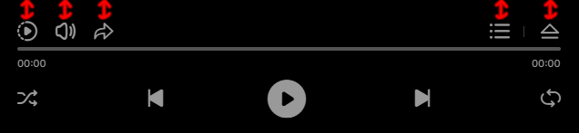
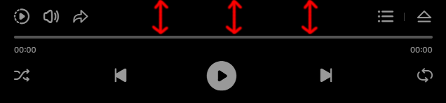
showScrubbersToolTips
Type: (String) - default: yes
This can be yes or no, show or not the scrubbers tooltips.
showLiveSettings
Type: (String) - default: no
This can be yes or no, show or not the live settings.
showLiveSettingsFrameCounter
Type: (String) - default: no
This can be yes or no, show or not the frame counter, this is used to see how the player performs on some devices, the optimal framerate is 60 FPS.
addKeyboardSupport
Type: (String) - default: yes
This can be yes or no, keyboard support, UP & DOWN ARROWS: volume up or volume down, M:mute / unmute, SPACE: play / pause, LEFT & RIGHT ARROWS: scrub audio.
googleAnalyticsTrackingCode
Type: (String) - default: ''
This google analytics tracking code, please watch this video tutorial for more info.
backgroundColor
Type: (String) - default: #000000
This main background color, if you want to use a transparent color please make sure to se the useUnrealBloomPass to no.
autoPlay
Type: (String) - default: no
This can be yes or no, this feature will try to play the audio/.mp3, if this is prevented by the autoplay browser policy the audio will start when the user first clicks the browser viewport and the player is in the browser viewport visible part.
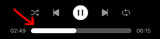
loop
Type: (String) - default: no
This can be yes or no, enable audio/.mp3 loop.
shuffle
Type: (String) - default: no
This can be yes or no, enable audio/.mp3 playlist shuffle.
randomizeTracks
Type: (String) - default: no
This can be yes or no, if enabled the playlist tracks will be randomized every time the page loads.
usePlayerControls
Type: (String) - default: yes
This can be yes or no, if this is set to no the player controls will not be showed/used and only the sphere will be visible.
showOnlyPlayButton
Type: (String) - default: no
This can be yes or no, if this is set to yes the player will show only the sphere and the play button over the sphere in the center.
showPlayerControls
Type: (String) - default: yes
This can be yes or no, if this is set to no the player will start with the controls hidden, otherwise it will start with the controls showed.
showArtwork
Type: (String) - default: yes
This can be yes or no, show the controls image artwork.
showArtistAndTitle
Type: (String) - default: yes
This can be yes or no, show the controls artist and title.
showCloseButtton
Type: (String) - default: yes
This can be yes or no, show the controls close/open button.
showPlayPauseButtonWhenHidden
Type: (String) - default: yes
This can be yes or no, show the controls close/open play/pause button.
showLikeButton
Type: (String) - default: yes
This can be yes or no, show the controls like button.
showPlayButton
Type: (String) - default: yes
This can be yes or no, show the controls play button.
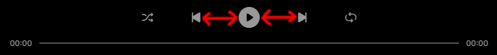
showNextAndPrevButtons
Type: (String) - default: yes
This can be yes or no, show the controls next and prev buttons.
showShuffleButton
Type: (String) - default: yes
This can be yes or no, show the controls shuffle buttons.
showLoopButton
Type: (String) - default: yes
This can be yes or no, show the controls loop button.
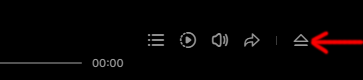
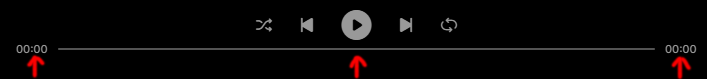
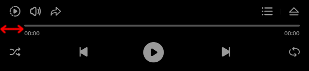
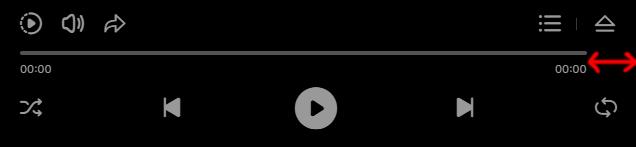
showScrubber
Type: (String) - default: yes
This can be yes or no, show the controls audio scrubber.
disableScrubber
Type: (String) - default: no
This can be yes or no, disable the controls audio scrubber, the user will not be able to scrubb the audio/.mp3.
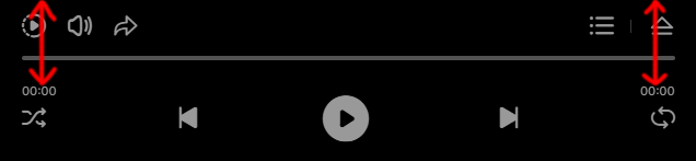
showTime
Type: (String) - default: yes
This can be yes or no, show the controls current and total time.
showArtistAndTitleToolTips
Type: (String) - default: yes
This can be yes or no, show the controls artist or title tooltips, if the title or artist is too long an ellipsis (...) is added at the end, in this case when the title or artist hovers a tooltip with the entire text will appear.
controlsOffsetHeight
Type: (Number) - default: 0
This ads to the total height in px of the player controls.
startGap
Type: (Number) - default: 16
Start gap in px.
endGap
Type: (Number) - default: 12
End gap in px.
gapBetweenCenterButtons
Type: (Number) - default: 24
Gap in px between the center buttons.
scrubberAndTimeBottomGap
Type: (Number) - default: 12
Scrubber and time bottom gap in px.
rightSideGapBetweenButtons
Type: (Number)- default: 4
Right side gap between buttons in px.

gapBetweenArtworkOrTitle
Type: (Number) - default: 14
Gap between artwork or title in px.
verticalGapBetweenTitleAndArtist
Type: (Number) - default: 8
Vertical gap between title and artist in px.
scrubberCircleRadius
Type: (Number) - default: 10
Audio scrubber circle radius in px.
compactScrubberCircleRadius
Type: (Number) - default: 12
Compact audio scrubber circle radius in px.
scrubberCircleTooltipGap
Type: (Number) - default: 6
Scrubber circle tooltip gap in px.

compactScrubberCircleTooltipGap
Type: (Number) - default: 8
Compact scrubber circle tooltip gap in px.
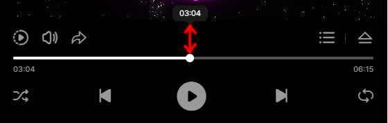
scrubberHeight
Type: (Number) - default: 2
Audio/.mp3 scrubber height in px.
scrubberAndTimeHorizontalGap
Type: (Number) - default: 20
Scrubber and time horizontal gap in px.

maxScrubberAndTimeWidth
Type: (Number) - default: 800
The maximum scrubber and time width in px.

showCompactVersionAtWidth
Type: (Number) - default: 720
The width in px at which the player changes the controls alignment to compact, if the player width is less or equal to this number the player will align the buttons in compact display type.
compactTopElementsStartGap
Type: (Number) - default: 20
Compact top elements start gap in px.
compactCenterButtonsStartAndEndGap
Type: (Number) - default: 14
Compact center buttons start and end gap in px.
compactButtonsStartGap
Type: (Number) - default: 15
Compact buttons start gap in px.
compactButtonsEndGap
Type: (Number) - default: 16
Compact buttons end gap in px.
compactButtonsVerticalGap
Type: (Number) - default: 4
Compact buttons vertical gap in px.
compactTimeVerticalGap
Type: (Number) - default: 66
Compact time vertical gap in px.
compactScrubberVerticalGap
Type: (Number) - default: 50
Compact scrubber vertical gap in px.
compactScrubberStartGap
Type: (Number) - default: 20
Compact scrubber start gap in px.
compactScrubberEndGap
Type: (Number) - default: 20
Compact scrubber end gap in px.
compactScrubberHeight
Type: (Number) - default: 4
Compact scrubber height in px.
controlsBackgroundColor
Type: (String) - default: #000000
Compact controller background color.
artistAndTitleToolTipsBackgroundColor
Type: (String) - default: #1A1A1A
Artist and title tooltiup background color.
titleTextColor
Type: (String) - default: #FFFFFF
Title text color.
artistTextColor
Type: (String) - default: #999999
Artist text color.
artworkBackgroundColor
Type: (String) - default: #3A3A3A
Artwork image background color.
lineSeparatorColor
Type: (String) - default: #3A3A3A
Line color between the close button and other buttons.
controlsButtonsIconNormalColor
Type: (String) - default: #3A3A3A
Controls buttons normal color.
controlsButtonsIconSelectedColor
Type: (String) - default: #FFFFFF
Controls buttons selected color.
timeColor
Type: (String) - default: #999999
Current time and total time color.
scrubberBackgroundColor
Type: (String) - default: #535353
Audio scrubber background color.
scrubberProgressColor
Type: (String) - default: #FFFFFF
Audio scrubber progress color.
scrubberToolTipBackgroundColor
Type: (String) - default: #1A1A1A
Audio scrubber tooltip background color.
scrubberToolTipTextColor
Type: (String) - default: #FFFFFF
Audio scrubber tooltip text color.
likeInfoBackgroundColor
Type: (String) - default: #FFFFFF
The controls like button count background color.
likeInfoTextColor
Type: (String) - default: #000000
The controls like button count text color.
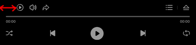
showVolumeButton
Type: (String) - default: yes
This can be yes or no, show or not the volume button.
showPlaybackSpeedButton
Type: (String) - default: yes
This can be yes or no, show or not the playback rate speed button.
defaultPlaybackRate
Type: (Number) - default: 1
The default playback rate speed, a number from 0.5 to 3 where 1 is the normal playback rate speed.
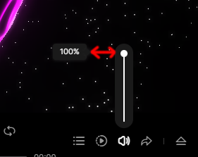
volume
Type: (Number) - default: 1
The default volume, a number from 0 to 1 where 1 is the maximum volume.
volumeScrubberCircleRadius
Type: (Number) - default: 10
The volume scrubber circle radius in px.
compactVolumeScrubberCircleRadius
Type: (Number) - default: 12
Compact mode volume scrubber circle radius in px.
volumeScrubberCircleTooltipGap
Type: (Number) - default: 6
The gap between the volume scrubber circle and tooltip in px.
compactVolumeScrubberCircleTooltipGap
Type: (Number) - default: 8
The gap between the volume scrubber circle and tooltip in px.
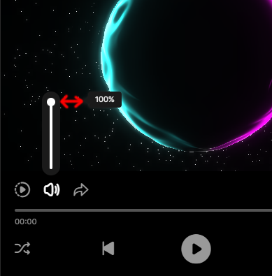
volumeScrubberMainWidth
Type: (Number) - default: 26
Volume scrubber main width in px.
volumeScrubberMainHeight
Type: (Number) - default: 120
Volume scrubber main height in px.
volumeScrubberWidth
Type: (Number) - default: 2
Volume scrubber width in px.
compactVolumeScrubberWidth
Type: (Number) - default: 4
Volume scrubber width in px when compact.
volumeBackgroundColor
Type: (Number) - default: #1A1A1A
Volume background color.
volumeScrubberBackgroundColor
Type: (Number) - default: #535353
Volume background color.
volumeScrubberProgressColor
Type: (Number) - default: #FFFFFF
Volume scrubber progress color.
volumeScrubberToolTipBackgroundColor
Type: (Number) - default: #1A1A1A
Volume scrubber tooltip background color.
volumeScrubberToolTipTextColor
Type: (Number) - default: #FFFFFF
Volume scrubber tooltip text color.
shareButtons
Type: (Array) - default: ['facebook', 'twitter', 'linkedin', 'tumblr', 'pinterest', 'reddit', 'buffer', 'digg','blogger']
Share button and share buttons window. Set the order as you want and remove the ones that you don't need. If you don't want to use the share button leave this option empty shareButtons:[] or remove it completely.
shareBackgroundColor
Type: (String) - default: #191919
Share window background color.
shareText
Type: (String) - default: Share via
Share window background color.
shareTextColor
Type: (String) - default: #FFFFFF
Share header text color.
shareLineSeparatorColor
Type: (String) - default: #3A3A3A
Share header line separator.
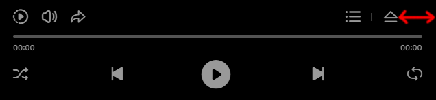
showPlaylist
Type: (String) - default: yes
This can be yes or no show or hide the playlist button.
startAtTrack
Type: (Number) - default: 0
The track that plays first when the player loads, the count starts from zero(0).
playlistItemHeight
Type: (Number) - default: 80
Playlist item height in px.
playlistMobileItemHeight
Type: (Number) - default: 80
Playlist item height in px for mobile devices.
playlistEndGap
Type: (Number) - default: 60
Playlist end gap in px.
showPlaylistArtwork
Type: (String) - default: yes
This can be yes or no, show the playlist artwork image.
showPlaylistPlayButton
Type: (String) - default: yes
This can be yes or no, show the playlist play/pause button.
showPlaylistLikeButton
Type: (String) - default: yes
This can be yes or no, show the playlist like button.
showPlaylistAudioVisualizer
Type: (String) - default: yes
This can be yes or no, show the playlist visuzalizer.
hidePlaylistOnItemPlay
Type: (String) - default: no
This can be yes or no, if this is set to yes when a playlist item is clicked the playlist will hide otherwise will remain visible.
scrollbarWidth
Type: (Number) - default: 2
The scrollbar width in px, the scrollbar hit area is much larger that the scrollbar visual part...
scrollbarTrackColor
Type: (String) - default: #535353
The scrollbar track color.
scrollbarHandlerNormalColor
Type: (String) - default: #999999
The scrollbar handler normal color.
scrollbarHandlerSelectedColor
Type: (String) - default: #FFFFFF
The scrollbar handler selected color.
playlistSeparatorColor
Type: (String) - default: #1A1A1A
The separator line color between the playlist and controls.
playlistVisualizerBarsColor
Type: (String) - default: #FFFFFF
Playlist item visualizer bars colors.
playlistItemNormalBackgroundColor
Type: (String) - default: #000000
Playlist item normal background color.
playlistItemSelectedBackgroundColor
Type: (String) - default: #0C0C0C
Playlist item selected background color.
playlistItemTitleColor
Type: (String) - default: #FFFFFF
Playlist item title color.
playlistItemArtistColor
Type: (String) - default: #999999
Playlist item artist color.
segmentsCount
Type: (Number) - default: 612
The sphere segment count, the number triangles used to render the sphere in the 3D space, the more is used the better the sphere will look but it will also consume more GPU resources.
mobileSegmentsCount
Type: (Number) - default: 512
The sphere segment count for mobile devices, the number triangles used to render the sphere in the 3D space, the more is used the better the sphere will look but it will also consume more GPU resources.
macOSSegmentsCount
Type: (Number) - default: 256
The sphere segment count for MAC OS, the number triangles used to render the sphere in the 3D space, the more is used the better the sphere will look but it will also consume more GPU resources.
useDrag
Type: (String) - default: yes
This can be yes or no, enable the drag to rotate the sphere.
showFront
Type: (String) - default: no
This can be yes or no, show the sphere front, by default it is showing the sphere back dark side.
useUnrealBloomPass
Type: (String) - default: yes
This can be yes or no, post-processing effect available in Three.js that simulates bloom, similar to what Unreal Engine provides, please note that this feature adds to the overall performace so if you have GPU performance issues set it to no.
useUnrealBloomPassOnMobile
Type: (String) - default: yes
This can be yes or no and applies to mobile devices, post-processing effect available in Three.js that simulates bloom, similar to what Unreal Engine provides, please note that this feature adds to the overall performace so if you have GPU performance issues set it to no.
unrealBloomPassStrength
Type: (Number) - default: 0
Unreal bloom pass strength.
unrealBloomPassRadius
Type: (Number) - default: 0.316
Unreal bloom pass radius.
unrealBloomPassThreshold
Type: (Number) - default: 0
Unreal bloom pass threshold.
unrealBloomPassTintColor
Type: (String) - default: #ff07fd
UInreal bloom pass tint color.
unrealBloomPassTintStrength
Type: (String) - default: 0
UInreal bloom pass tint strength.
uBackgroundColor
Type: (String) - default: #000000
Sphere main color.
uSphereRotationDirection
Type: (String) - default: clockWise
The initial sphere rotation, it can be clockWise and counterClockWise.
cameraOffsetZ
Type: (Number) - default: 6
The initial camera Z position, this will make the sphere and particles smaller or larger depending of how far the camera is positioned.
cameraOffsetZWhenCompact
Type: (Number) - default: 6
The initial camera Z position for the compact mode, this will make the sphere and particles smaller or larger depending of how far the camera is positioned.
cameraOffsetYWhenCompact
Type: (Number) - default: .13
This parameter will move the sphere up or down for the compact mode, it is useful to tweak the vertical position in some cases.
uSphereStartAngleY
Type: (Number) - default: 0
This parameter allows to set the sphere position at a specific angle on the Y axis in degrees.
uSphereRotationSpeed
Type: (Number) - default: .4
Fine tune sphere rotation speed when dragged.
uLightAColor
Type: (String) - default: #ff07fd
This first light color.
ulightAIntensity
Type: (Number) - default: 1.85
This first light intensity.
uLightAColorPhi
Type: (Number) - default: 0.615
This first light horizontal rotation in radians.
uLightAColorTheta
Type: (Number) - default: 0.615
This first light vertical rotation in radians.
uLightBColor
Type: (String) - default: #32ffff
This second light color.
ulightBIntensity
Type: (Number) - default: 1.4
This second light intensity.
uLightBColorPhi
Type: (Number) - default: 2.561
This second light horizontal rotation in radians.
uLightBColorTheta
Type: (Number) - default: -1.844
This second light vertical rotation in radians.
uDistortionFrequency
Type: (Number) - default: 2.615
Sphere distortion frequency.
uDistortionStrength
Type: (Number) - default: 0.65
Sphere distortion strength.
uDisplacementFrequency
Type: (Number) - default: 2.120
Sphere displacement frequency.
uFresnelOffset
Type: (Number) - default: -1.9
The Fresnel ofsset, factor that alters the reflectiveness of a sphere surface based on the camera or viewing angle, fresnel in action here.
uFresnelMultiplier
Type: (Number) - default: 3.557
Fresnel multiplier, factor that alters the reflectiveness of a sphere surface based on the camera or viewing angle, fresnel in action here.
uFresnelPower
Type: (Number) - default: 1.793
Fresnel power, factor that alters the reflectiveness of a sphere surface based on the camera or viewing angle, fresnel in action here.
showParticles
Type: (String) - default: no
This can be yes or no, show the galaxy particles.
particlesCount
Type: (Number) - default: 800
Total galaxy particles number.
mobileParticlesCount
Type: (Number) - default: 800
Total galaxy particles number for mobile devices.
uParticlesRotationDirection
Type: (String) - default: clockWise
This can be clockWise or counterClockWise, the galaxy particles rotation.
particlesMinRadius
Type: (Number) - default: 1
The galaxy particles minimum radius, 1 is the Sphere diameter.
particlesMaxRadius
Type: (Number) - default: 4
The galaxy particles maximum radius, 1 is the Sphere diameter.
uParticlesRotationSpeed
Type: (Number) - default: 4
The galaxy particles rotation speed.
particlesSizeFactor
Type: (Number) - default: .5
The galaxy particles size factor, the higher this number the larger the galaxy particles will look.
particlesAmplitudeColor
Type: (String) - default: #FFFFFF
The galaxy particles amplitude color, this particles will animate based on the audio amplitude
particlesMidsColor
Type: (String) - default: #FFFFFF
The galaxy particles mids color, this particles will animate based on the audio mids.
particlesTrebleColor
Type: (String) - default: #FFFFFF
The galaxy particles treble color, this particles will animate based on the audio treble.
Methods
Methods are functions that can be called via the API to execute certain actions.
JavaScript methods look like fwdpap0.methodName( /* arguments */ ), please note that fwdpap0 is the player instance name, if you are using multiple players don't forget to set the instance unique for each instance like this fwdpap1, fwdpap2, fwdpap3, etc... depending on how many players are added.
play
.play()
Play the audio/.mp3.
pause
.pause()
Pause the audio/.mp3.
stop
.stop()
Stop the audio/.mp3 and the loading.
playNext
.playNext()
Play the next audio/.mp3 in the playlist.
playPrev
.playPrev()
Play the previous audio/.mp3 in the playlist.
playShuffle
.playShuffle()
Play shuffle audio/.mp3 in the playlist.
playTrack
.playTrack(id:Number)
Play audio/.mp3 in the playlist based on id.
Parameters
- id (Number) - the id of the track to play in the playlist (counting starts from 0).
setVolume
.setVolume(volume:Number, updateController:Boolean)
Set the audio/.mp3 volume.
Parameters
- volume (Number) - the volume from 0 to 1 where 1 is the maximum volume.
- updateController (Boolean) - update the volume scrubber.
setPlaybackRate
.setPlaybackRate(rate:Number)
Set the audio/.mp3 playbackrate speed.
Parameters
- rate (Number) - the playbackrate speed from 0.5 to 3 where 1 is the default.
getPlaybackRate
.getPlaybackRate():Number
Returns the current playback rate speed.
startToScrub
.startToScrub()
Notifiy the player that an audio/.mp3 scurb starts.
stopToScrub
.stopToScrub()
Notifiy the player that an audio/.mp3 scurb finished.
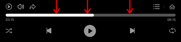
scrubbAtTime
.scrubbAtTime(duration:String)
Scrub the audio/.mp3 to a specific time.
Parameters
- duration (String) - duration at which to scrub the audio/.mp3 [hours:minuts:seconds], ex: 00:10:25.
scrub
.scrub(percent:Number)
Scrub the audio/.mp3 to a specific percent.
Parameters
- percent (Number) - percent at which to scrub the audio/.mp3 from 0 to 1 where 0.5 is 50 percent.
getCurrentTime
.getCurrentTime():String
Returns the current in fromat [hours:minuts:seconds], ex: 00:10:25.
getDuration
.getDuration():String
Returns the audio/.mp3 duration in format [hours:minuts:seconds], ex: 00:10:25.
destroy
.destroy():Void
Destory the player instance and remove it from DOM.
Events
Plasmic Audio Player has many events, they are added via the addEventListener method add accessed via the instance name.
The events must be registered when the API is ready.
// API.
let fwdpapAPI = setInterval(() =>{
if(window['fwdpap0']){
	console.log('PAP API ready')
	clearInterval(fwdpapAPI);

	// Register the LIKE event.
	fwdpap0.addEventListener(FWDPAP.LIKE, onLike);
}
}, 100);


// Listen for the LIKE event.
function onLike(e){
	console.log(e)
}
FWDPAP.SHOW_CONTROLS
FWDPAP.SHOW_CONTROLS
Dispatched when the controls are showed.
FWDPAP.HIDE_CONTROLS
FWDPAP.HIDE_CONTROLS
Dispatched when the controls are hidden.
FWDPAP.UPDATE_VOLUME
FWDPAP.UPDATE_VOLUME
Dispatched when the volume is changed.
Parameters
- volume (Number) - the current volume.
FWDPAP.UPDATE_PLAYBACK_SPEED
FWDPAP.UPDATE_PLAYBACK_SPEED
Dispatched when the playback rate is changed.
Parameters
- playbackRate (Number) - the current playbackrate speed.
FWDPAP.PLAY_COMPLETE
FWDPAP.PLAY_COMPLETE
Dispatched when the audio/.mp3 has finished to play.
FWDPAP.PAUSE
FWDPAP.PAUSE
Dispatched when the audio/.mp3 is paused.
FWDPAP.PLAY
FWDPAP.PLAY
Dispatched when the audio/.mp3 plays.
FWDPAP.STOP
FWDPAP.STOP
Dispatched when the audio/.mp3 is stopped.
FWDPAP.UPDATE_TIME
FWDPAP.UPDATE_TIME
Dispatched when the audio/.mp3 is playing and the time is updated.
Parameters
- curTime (String) - the current time in format [hours:minuts:seconds], ex: 00:10:25.
- totalTime (String) - the current time in format [hours:minuts:seconds], ex: 00:10:25.
FWDPAP.UPDATE
FWDPAP.UPDATE
Dispatched when the audio/.mp3 playing.
Parameters
- percent (Number) - the current percent played from 0 to 1.
FWDPAP.LIKE
FWDPAP.LIKE
Dispatched when like button is clicked.
Parameters
- id (Number) - the current playing playlist track id starting from 0.
- playlistName (String) - the playlist name.
- playlistItem (Object) - an object with detailed information about the liked track.
Notes
I've been working on this player for almost an year, it was a challange to bring the 3D world and WebGL in a real project, I will continue to improve it and add new features.
For me this is more than a job, it is my passion, I love to create innovative tools that my clients can benefit from. @Tibi - FWD.
For support and customizations please write to me directly at this email.